Befriend the city!
Soukle is all about making the city of Atlanta feel smaller for those live and work in it. Each month, young, career-minded professionals gather together at one of many great, Soukle-hosted after work hang out spots around Atlanta. Soukle forges new friendships, creates new opportunities for professional collaboration and encourages a sense of community engagement.
The situation
Founded by Jamillah Rahmaad, “Atlanta Happy Hour Epicure” (AKA “Atlanta Happy Hour” and “Happy Hour Epicure”) had enjoyed quick fame in the few months since it launch—fame that only seemed poised to grow. In short order, many people joined the Meet-Up organized group and enjoyed the organization’s friendly, non-traditional networking socials. Establishments took quick note contacting Jamillah with requests for her organization to host future socials at their venues. All good stuff, right?
The problem
Having gained traction faster than expected, Atlanta Happy Hour Epicure’s identity was developing on the fly and without thought-through direction. Though enjoying growth, much brand equity was being lost with the lack of clearly defined brand promises, a frayed naming convention and virtually no brand identity. In short, Jamillah’s organization was suffering a major identity crisis that was costing her wins within the community of Atlanta’s young working professionals.
Jamillah asked Thinkory to help her organization define its brand, refine its name and craft an identity that would foster a special sense of ownership among the organization’s members.

The thinking
Experience an Atlanta Happy Hour Epicure-hosted social first hand and capture attendee impressions. Then combine those discoveries with our own to clarify the future and develop a brand, name and identity out of that clarity.
After several weeks of a deeply explorative brand clarification process, values, vision and precepts were now sharply defined. Time to turn our attention to the organization’s name. Jamillah didn’t use a unified naming or identity convention across communication channels or at the socials themselves. Between events, meetup.com, her organization’s website and social media, various versions of the name were used—making it less than simple for people to attribute credit for great experiences.

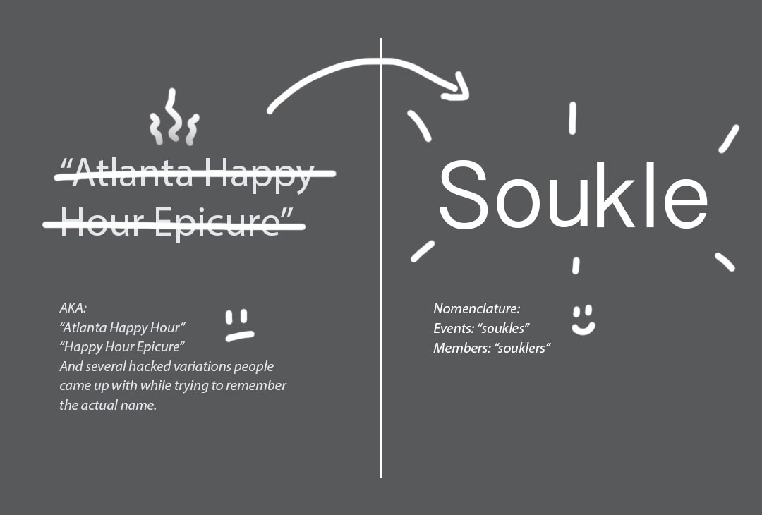
We set our criteria for the new name including the need for it to be brief, easy to remember and fun to say. We also wanted the organization’s new name to be positive, future-facing and modular lending itself to brand extensions that would embed the word in members’ lexicon.
A great process of collaborative discovery and deliberation led us to “Soukle” (sō-kəl), a name we agreed met the criteria and was a curious, empty vessel that we could fill over time and with great experiences. With the wonderfully protectable name set, we got on with the work of crafting an identifying mark.
Guided by the brand brief, it occurred to us that crafting a polished, graphically perfect mark would be a misstep for Soukle. This is an organization that thrives when people add their honest, imperfect selves to the mix and find others with whom that honesty resonated. Instead, a sense of personality needed to be projected through the identity.
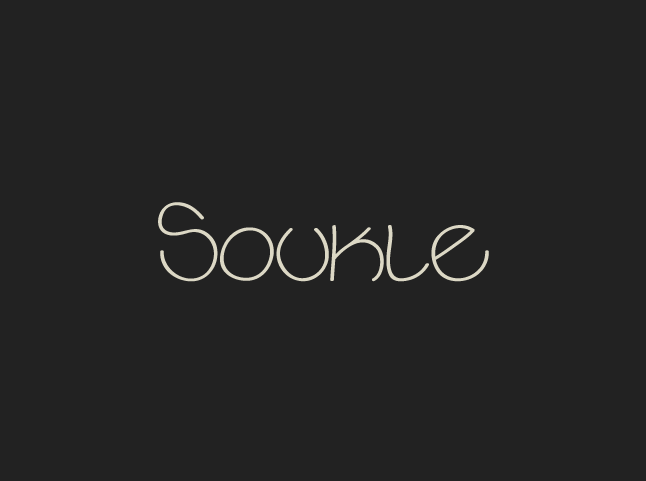
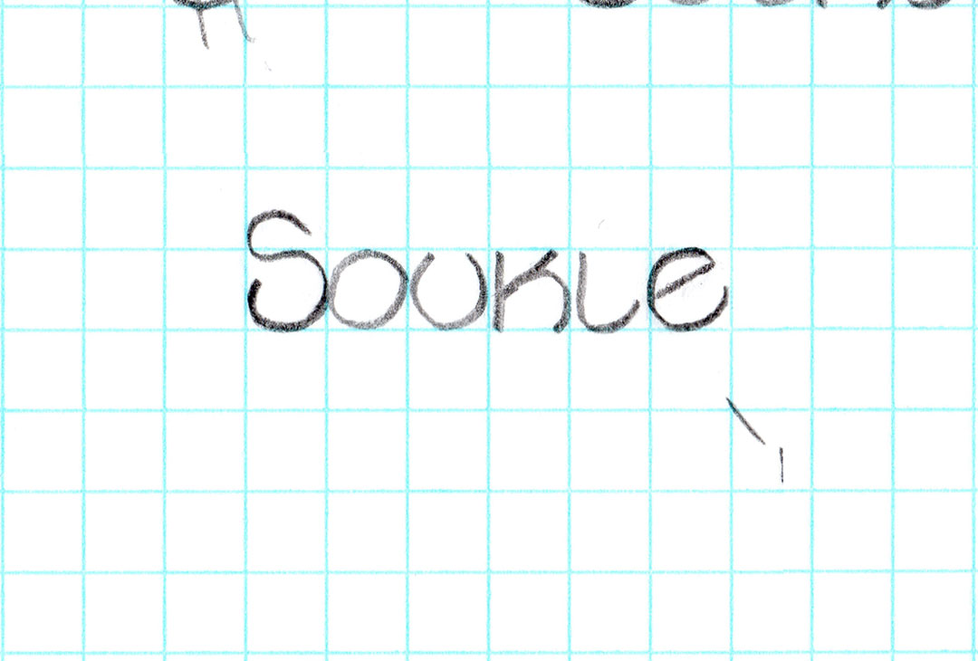
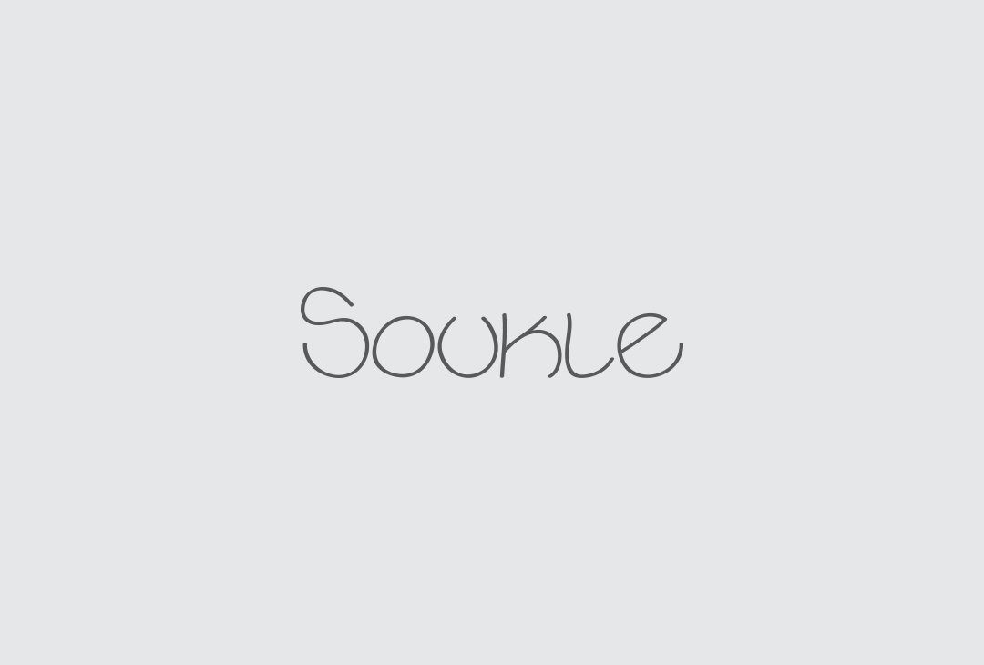
Soukle’s wordmark was rendered true to the hand lettering—imperfect strokes, varying line widths and all. It’s a handmade feel that gives the those turned off by pretenses a sense of belonging.

Soulke is a tribe if nothing else. And every tribe needs a good symbol. We all knew it should be as simple and hand-crafted as the wordmark. Soukle’s symbol was inspired by the modern map pinpoint. Its a sort of waypoint saying, “Hey, good gatherings are happening here.”
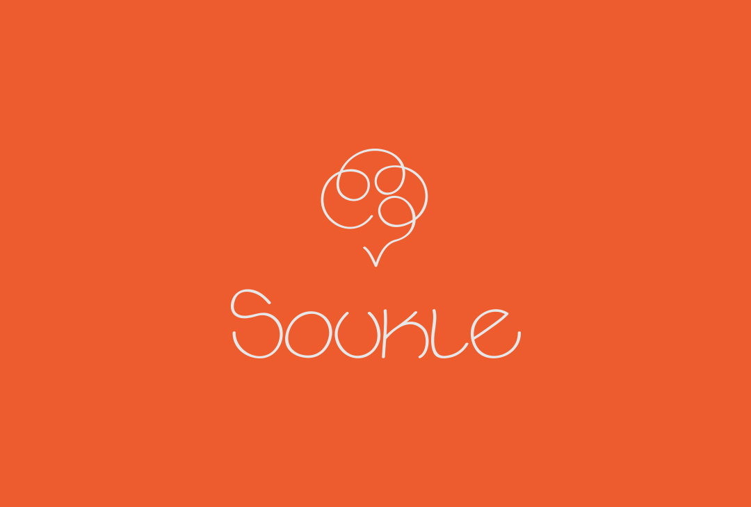
Locked together, Soukle’s brand mark is a beacon of honest engagement, trust and friendship. It’s a mark that directs people to a recollection and a reputation of creating great experiences at great places with good company.
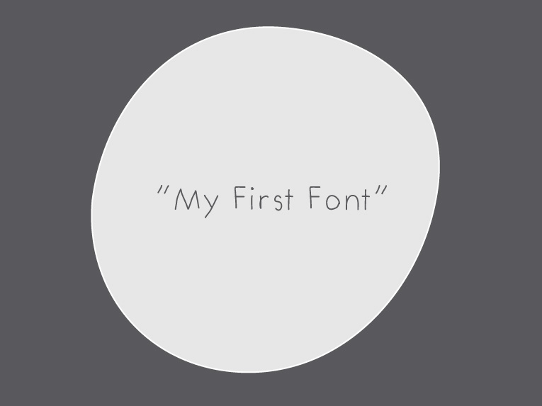
Undoubtedly, a hand-crafted mark deserves a hand-crafted typeface. We found the lovely “My First Font” a perfect fit for feel Soukle needed to maintain in messaging.
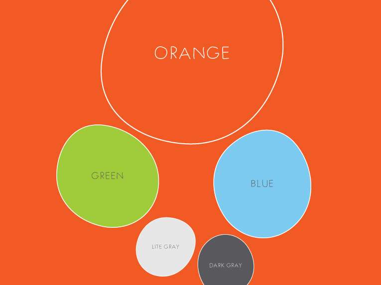
Soukle needed to have a lot of versatility and freedom of honest, energetic expression. So, led by a lively reddish-orange, we created a diverse and youthful set of hues to use.
The execution
Putting the plan to use has been rewarding. Jamillah constantly surprises us with the depths of energy and faith she puts behind the brand we were honored to craft with her. Much was and will be accomplished thanks to her bravery.
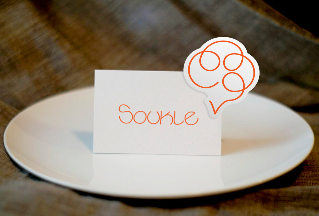
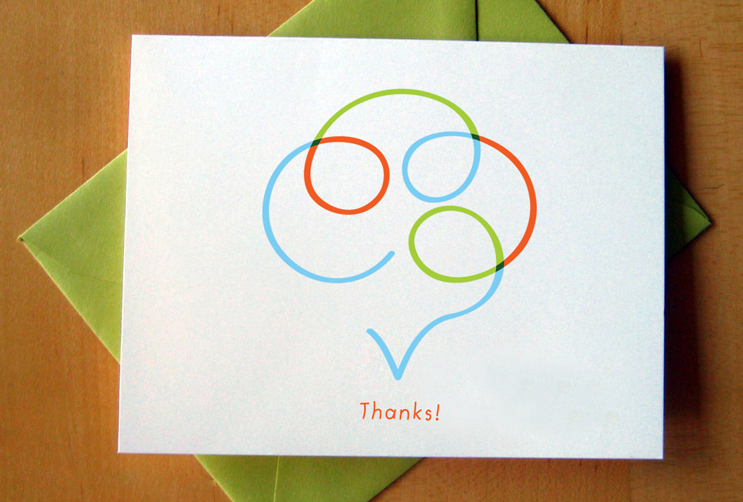
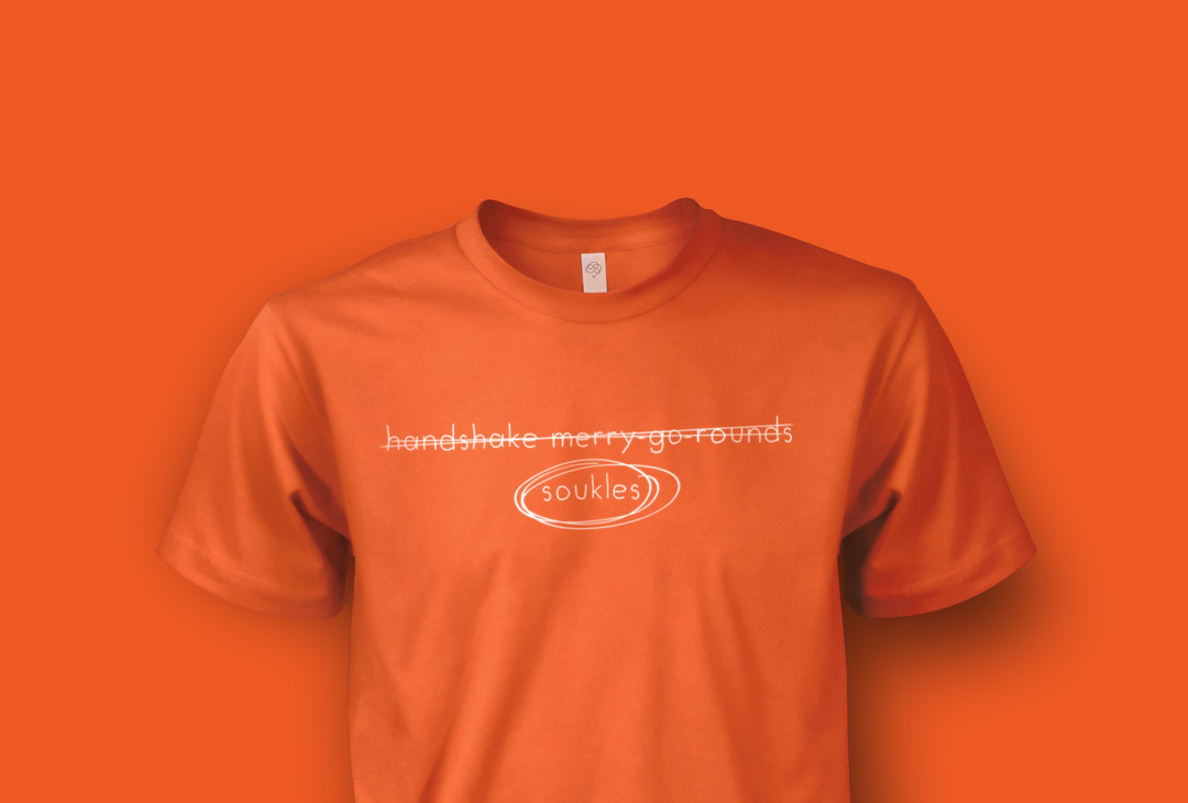
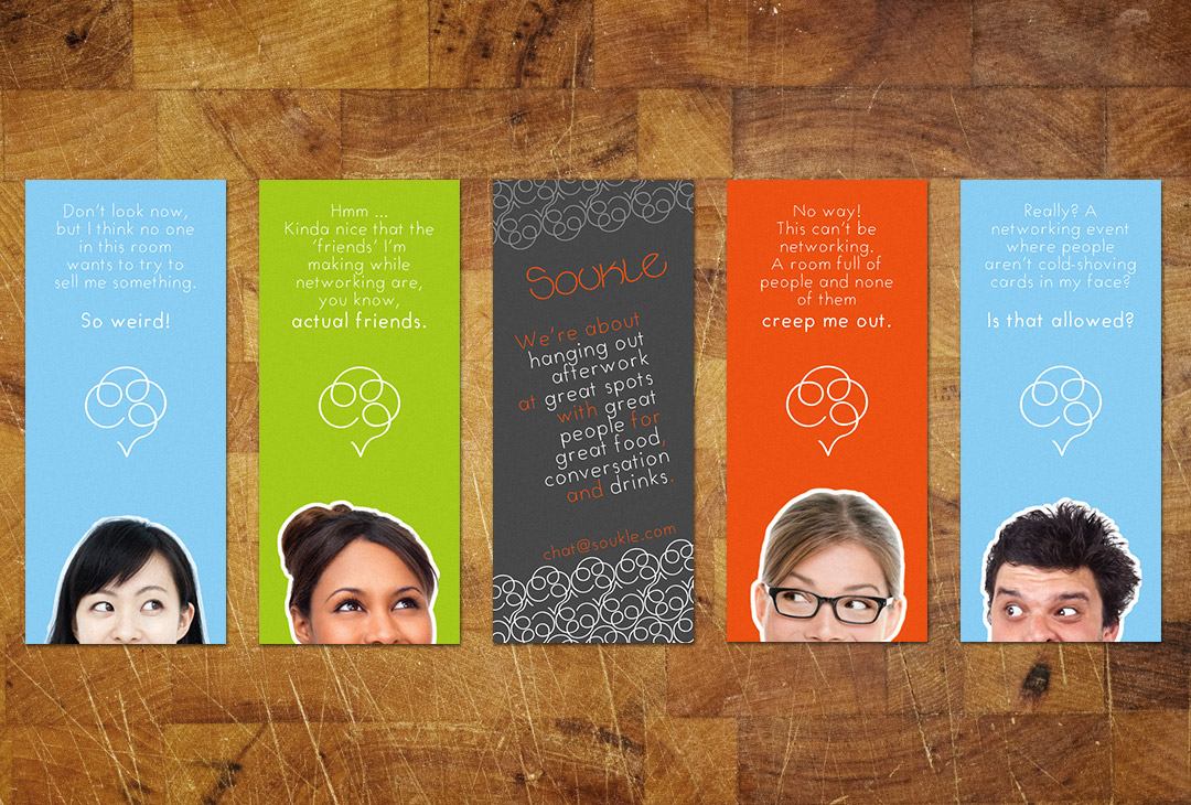
We created a deck of minicards that featured one of several messages on the front and a common design on the back. The front messages each spoke to members who’ve expressed a preference for a more meaningful “networking” experience. The back-side of the cards offered a quick and simple introduction to Soukle.
The result
In the happy end, “Atlanta Happy Hour Epicure” enjoyed new confidence of identity as Soukle. Members fondly accepted the whimsically energetic vibe given off by the new brand identity and no existing members were lost in the transition. Membership growth, in fact, accelerated!
People get it; Soukle is seriously about making meaningful connections between people, but doesn’t take itself too seriously in the process. It opens wide its arms and says, “You belong. We were just waiting for you to show up.”
The love
 After in-depth conversations, a brand, a mark, key messaging and a formula for the future was built for my company. Ralston and Thinkory did an excellent job of guiding me through the brand crafting process and pushing out my brightest ideas. The vision we captured for my brand was cohesively aligned within every brand expression we design for my company. Everything was perfect and just made sense. I highly recommend working with Thinkory!
Jamillah Rahmaad
Founder, Soukle
