If you can’t find the words,
find the shirt.

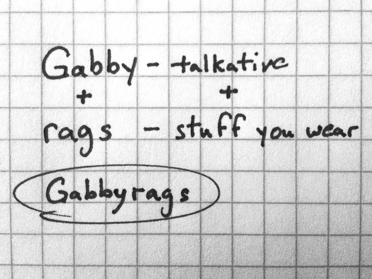
At Thinkory, we’re suckers for good type and a great saying. So we embarked on a journey to bring both together. The idea: make uniquely expressive, words-only t-shirts people will love to wear. No graphics. No worn out adages.

Our journey is just beginning, but we love you, so we’re excited to show you what we’ve crafted so far.

The problem

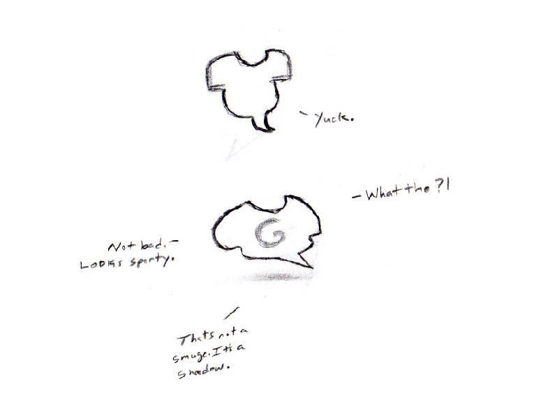
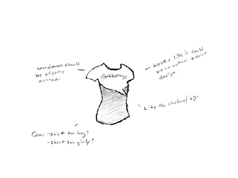
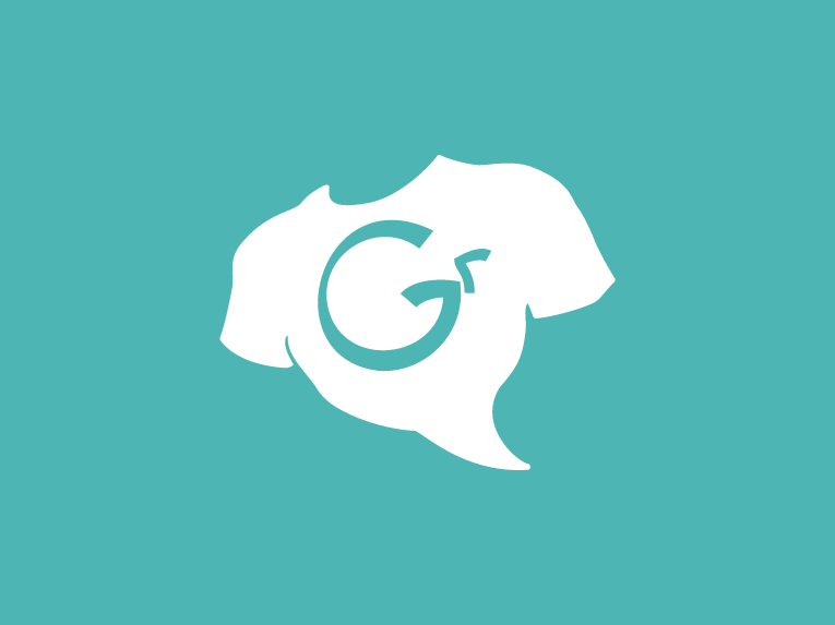
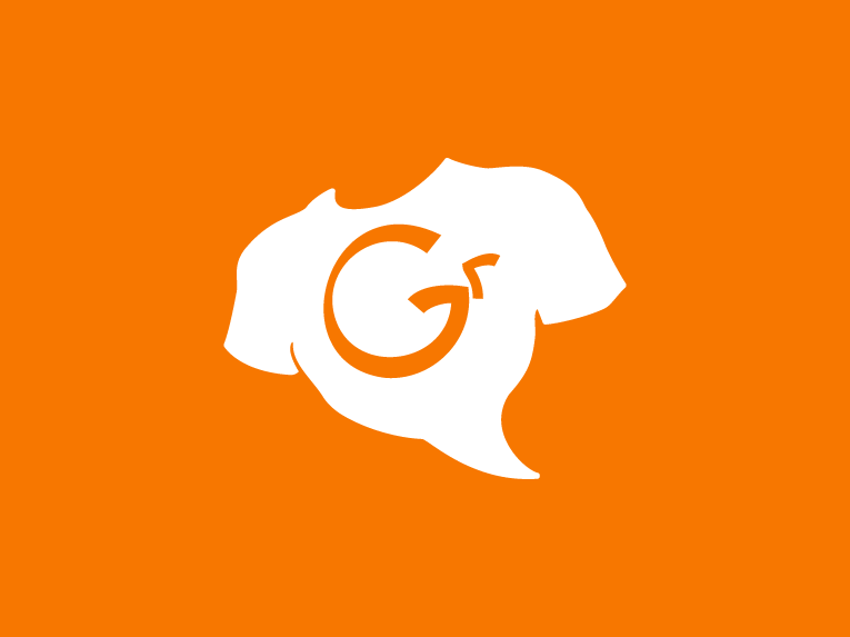
For us, the idea was full and exciting, but as a brand, it was formless. No core purpose, no solid name and certainly no visual identity. We were sitting squarely in square one.

The thinking

Is it possible to craft a brand in such a way that it celebrates self expressiveness and conversation even in its name? And how do we design the identity so that it feels like a hero of individualism?

A brand goes nowhere without a big idea powering it forward. So to assemble ours, we spent much time examining what we wanted to do with these t-shirts. What lives we wanted them to enhance and how. What future we wanted to realize. The thoughts were synthesized to form what would be the company’s mantra; the big idea its brand could be aligned behind.

We’re a little embarrassed to admit the phrase was actually born out of a misunderstanding of the chorus of a favorite John Mayer song, Say.
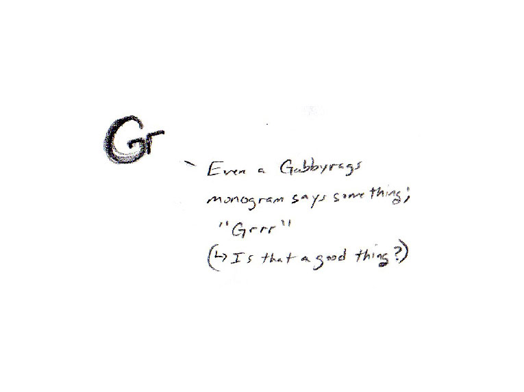
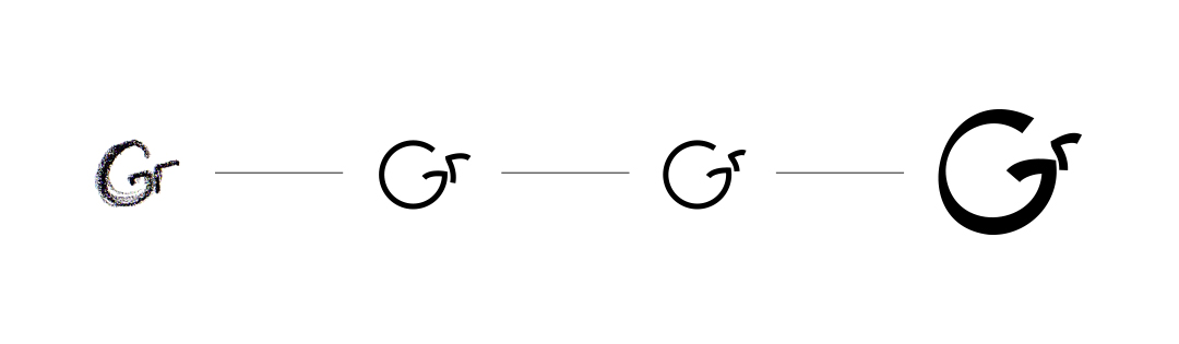
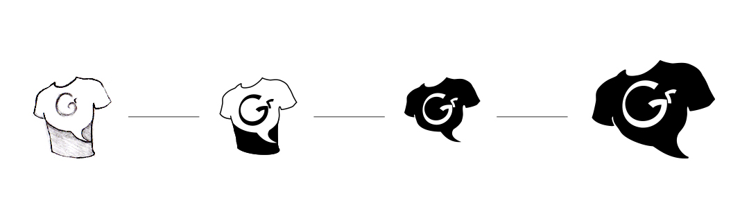
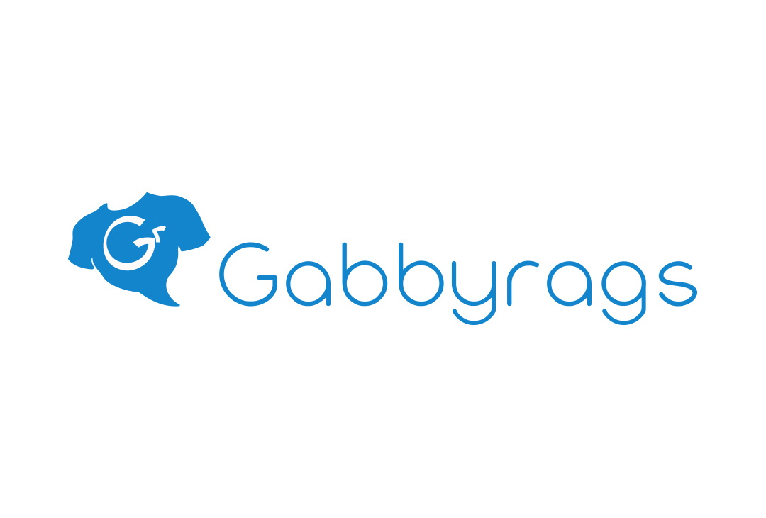
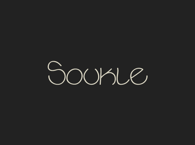
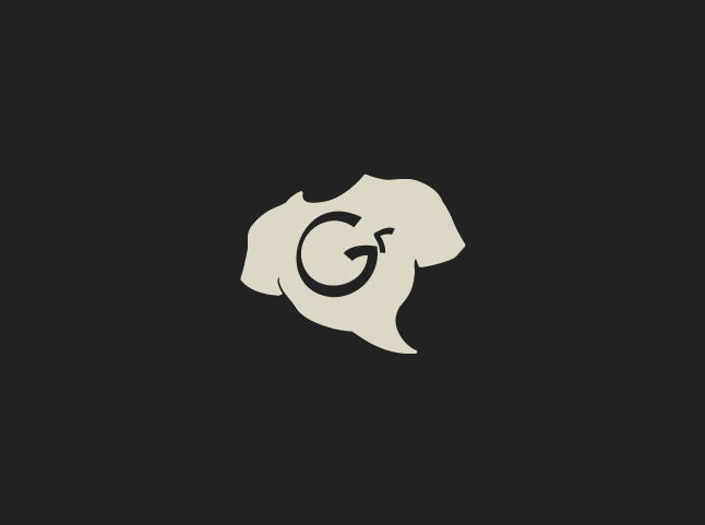
Now what the heck do we call it?! The process took many weeks and there were several reasonable finalists, but nothing rang truer than “Gabbyrags.” Short, youthful, defensible. We really liked the playfulness of the name and how it didn’t use expected reference words like ‘clothing,’ ‘T-shirts,’ or ‘apparel,’ but ‘rags.’ Delightfully irreverent.
Combining a hand-drawn shirt and speech bubble, we created a simple and versatile little icon. Its angle and pitch are also intended to give it that heroic poise. Think about it, who is the extroverted life of the party if not the hero saving others from the dreads of another boring social gathering?
The typeface of Gabbyrags’ wordmark had to be chummy. Something you felt comfortable pulling up a stool next to for a random chat. Unable to find the perfect blend of attributes, we developed our own using the perfect shape as the foundation for the design; the circle.
Though the symbol and wordmark customarily lock well together, we love that Gabbyrags’ brandmark is modular. The monogram, “tee-bubble,” monogram-tee symbol and wordmark can each be used individually giving this brand identity a wide range of expression.
It made sense that the color palette be varied for a brand that celebrates self expressiveness.

The result

The makings of a brand with a name and visual identity we absolutely love. Again, there is still much more road to travel for this brand we’re developing internally, but we definitely dig its potential.