Helping love happen.
SoL Oasis was the name of a beautiful boutique spa tucked away in the Dunwoody area of Atlanta. KaSundra Anderson, its owner, ran the tiny shop driven by her faith in Jesus and His greatest commandment; love one another. Her genuine love for whomever sat in the client’s seat or worked along side her garnered SoL Oasis many loyal fans.
The situation
Loved as her business was, KaSundra found herself facing door-closing challenges—a downward spiral of shifting prices, an eroding client-base and no solid, differentiating proposition in a densely crowded market. Challenges that implied symptoms. Symptoms that implied a desperately unhealthy brand. KaSundra reached out to Thinkory for help.
The problem
A series of discovery visits and discussions revealed several faults in the foundation of SoL Oasis’s brand and business. Its purpose, core values and vision for the future of the shop were never clearly defined. Those faults led to a business model that struggled against SoL Oasis’s greatest asset; its tiny size. Additionally, it’s name, “Sol Oasis,” provided no beacon for the right clients for the shop.

The thinking
Remodel the business to leverage its unique attributes. Clarify the brand defining purpose, core values, vision and precepts. Then establish a new name that illuminates those truths and an identity that draws in ideal clients. Clients who would appreciate the spa’s unique setting and service experience.
“We exist to deliver loving respite to people weary from highly visible lifestyles. Our vehicle: private, professional spa experiences.”
We proceeded to remodel the way KaSundra’s business functioned. We factored its tiny stature together with what she loved about her work (touching people’s lives) to create a personal, private, single-client business model. Put simply, each client’s appointment occupied the entire establishment. No long row of manicure tables. No need for whisper soft conversations for neighboring strangers. The shop belonged to the client for as long as their appointment would last.
Around this new model, a purpose was discovered, an ideal client-type was defined and a promise was articulated. On to the name.
What’s a “SoL Oasis?”
And as unusual as the name was, “SoL Oasis” was fairly indefensible. The name was already secured in domain form and was also being used by others on both Facebook and Twitter. This forced KaSundra to create and make use of variants thereby weakening brand recognition and limiting brand equity. What’s more, the ambiguity of the “SoL Oasis” name hindered the emotional connections with people KaSundra’s business so desperately needed to make.
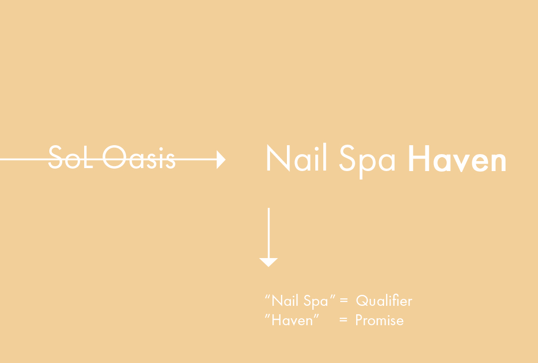
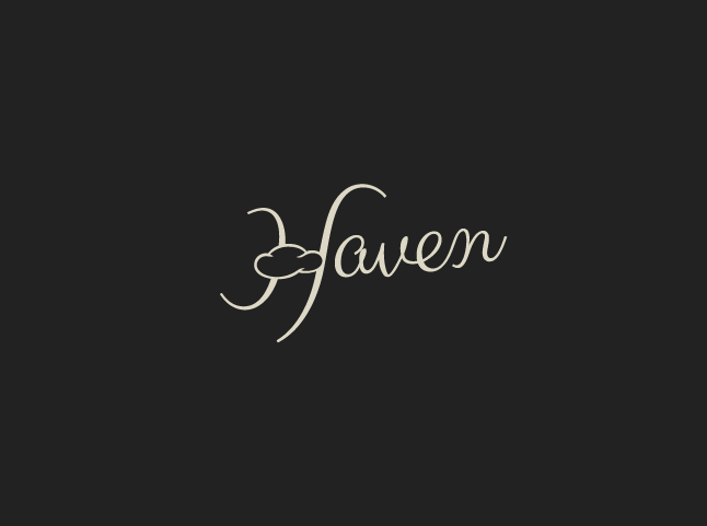
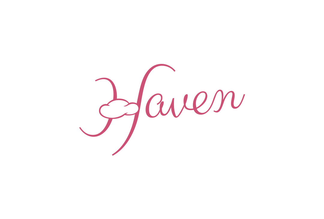
“Nail Spa Haven” is a name that makes a promise. While “Nail Spa” is plainly informative, “Haven” gives people an idea of what sort of experience they can expect. It’s a word that implies you are safe here. Safe to relax. Free to be you—whoever that “you” may be.
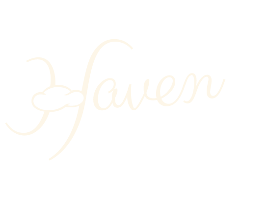
While the name is said or written wholly in certain official settings, when expressing the brand graphically, referring to the business in conversation, or greeting a guest, the name “Haven” is used alone.
With the name in place, it was time to put a face and feel to it.

For Haven, we wanted to project a proposition of freedom and safety. Expressive imagery of women releasing themselves into an act, activity or moment of solitude led the search process. Images that felt inline with a desired Haven feel were discovered and added to the board along the way.
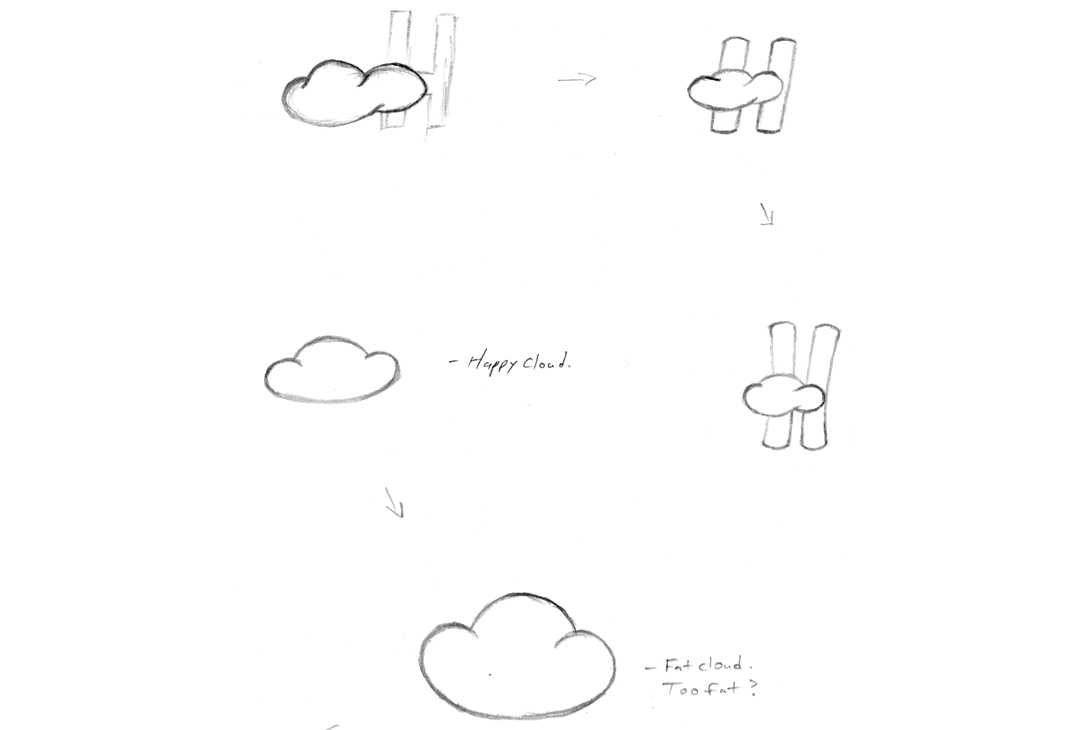
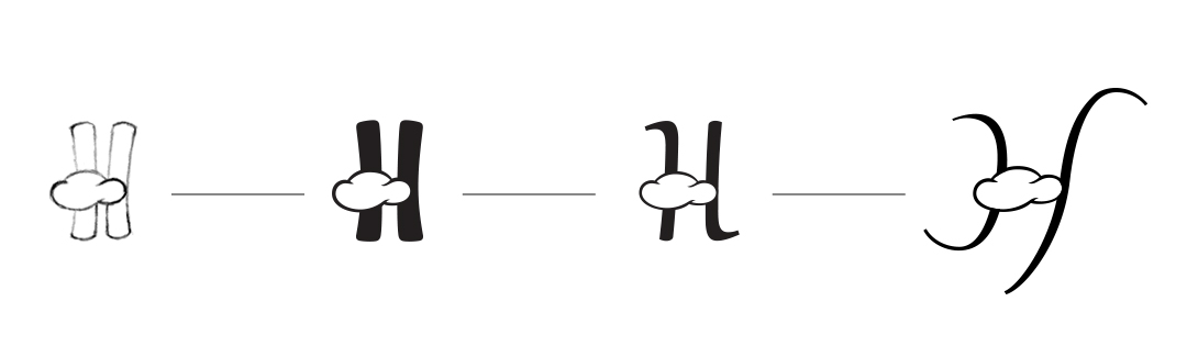
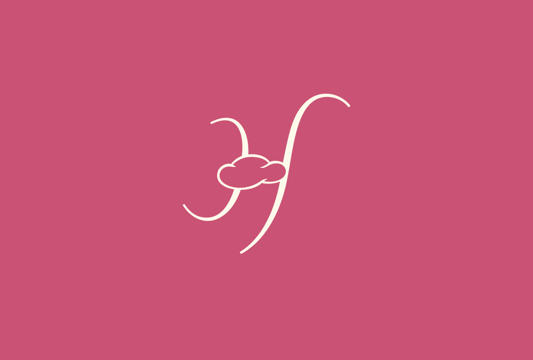
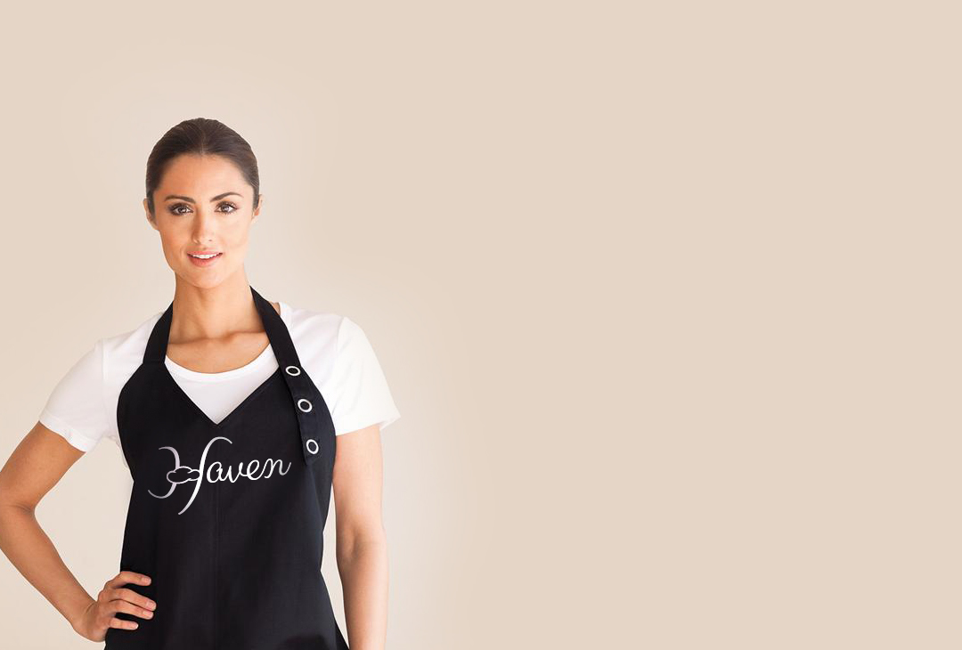
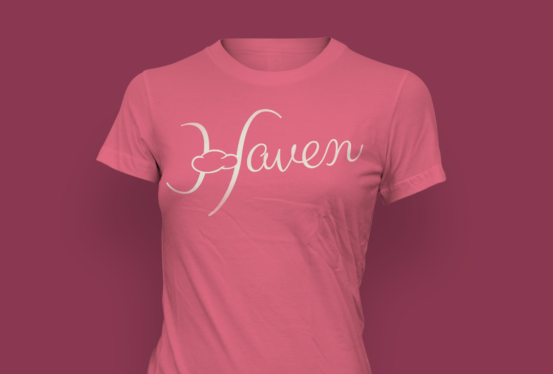
A small cloud symbolizes great strife and turbulence here. Hiding the bar of the letter “H” behind that cloud implies Haven’s position; a place of peace and respite found above the storm and stress of your life.

The message
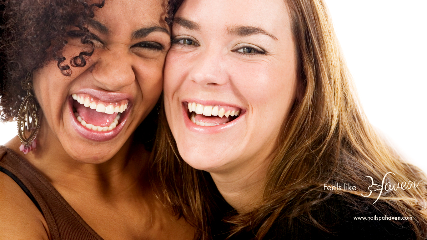
While creating the Haven brandmark, we couldn’t help but to fall in love with a particular message concept purposed to help make an intimate connection with Haven’s ideal client-types. People who would have a personal appreciation for the service experience Haven offers.
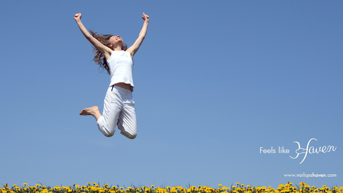
The following images illustrate the message which branches off Haven’s “Free to be beautiful” promise with the question, “what does beautiful feel like?” Haven addresses that question here using a simple composition of a photograph and a recurring slogan. Together, they aim to build an association between two truths: 1) a woman desires to freely be herself, and 2) Haven lovingly provides that freedom.
These pieces purposely avoid obvious ‘nail care’ service imagery or references. This isn’t about touting “we do nails good!” like most others in the crowd. This message differentiates by fostering a deeply emotional connection with a certain mindset. It’s about creating intrigue. And it’s about sparking a burning curiosity that ultimately asks the question, “Where is Haven?”


The result
KaSundra now has a name and identity that act as the vanguard of a clear promise: here, you are free to be beautiful.
The message is getting clearer and spreading wider as we continue to work with Haven to align all of the brand’s touchpoints behind these new precepts. In the meantime, KaSundra is enjoying the patronage of some pretty beautiful—and highly visible—people.
People like the radiant Ms. Knight.
 KaSundra Anderson, (R) Gladys Knight")