Stronger relationships make greater sales.
Clothier Connect promises to be an awesome utility app for people who sell apparel. A tool meant for career-minded, tech-curious and charismatic salespeople, Clothier Connect will help users capture and leverage client knowledge to increase sales effectiveness.
The problem
Still fully focused on developing the app itself, John Durden, Clothier Connect’s creator, found it challenging to set the brand’s foundation and build an appropriate identity atop it. He enlisted Thinkory to help think through core values, unearth deep truths and develop a manner of expression that would win trust and adoption by business-minded salespeople.

The thinking
Design a winsome mark that welcomes the sophisticated. A brandmark and identity crafted to feel like an outgrowth of the fashion and clothier community; the product of a culture, not merely a product for it.
The inspiration
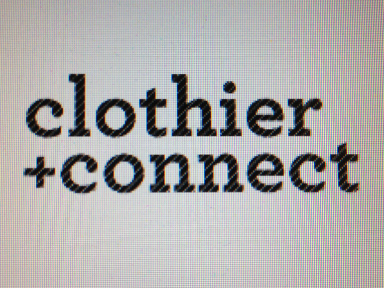
From the start, Clothier Connect’s name was to be displayed in the tall and stately Archer Book typeface. Initial explorations centered around that font and this image; an unsuspecting inspiration that came from a photo of a screenshot of a screenshot. Beauty found in degradation.

The mood board John and I assembled for this project captured a sure-of-self, jazzy and crafted feel. It set a smooth, confident tone for what would be the brand’s charismatic character.
The Clothier Connect monogram, hand-crafted to signify individuality and contentedness with a single, continuous and imperfectly patterned thread.
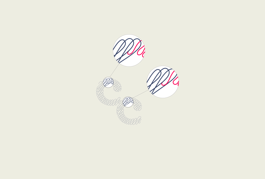
The single thread that creates the Clothier Connect monogram splits in two locations to take on new forms. The hidden detail is small nod to both that which makes us unique and how we are connected to one another.

Considering the creative brief and mood board developed with John, the mark needed to do more than follow the visual rules of an app logo. It needed to feel like it belonged to the clothiers and apparel sales people who would be expected to adopt it. The brandmark was crafted to feel more like it belonged on a shirt label than on an app icon.
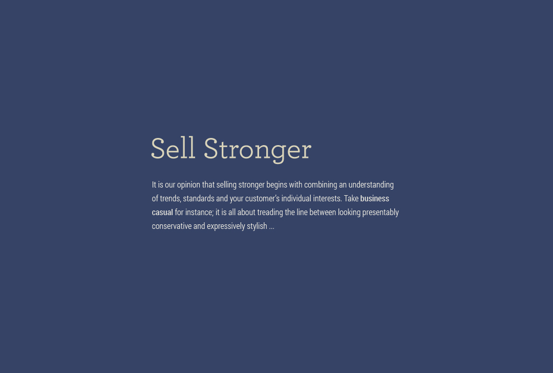
Knowing that Archer Book was to be the central font for the identity, a narrow san serif was determined to be the ideal complement. The versatile and web font-available Robot Condensed fit the bill rather nicely.

A modest color palette felt fitting for Clothier Connect’s identity. A classy deep blue, an earthy khaki and a sparsely-used fiery orange. Each of which can also be used at 40% opacity.
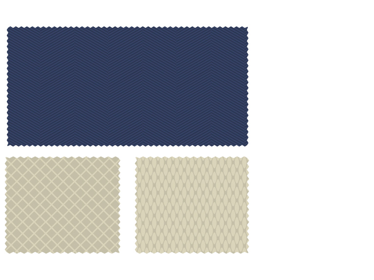
Patterns are greatly useful to express a brand’s personality. And with a brand made to be adopted by people who sell apparel, patterns like the popular herringbone were greatly appropriate to adopt.
The future
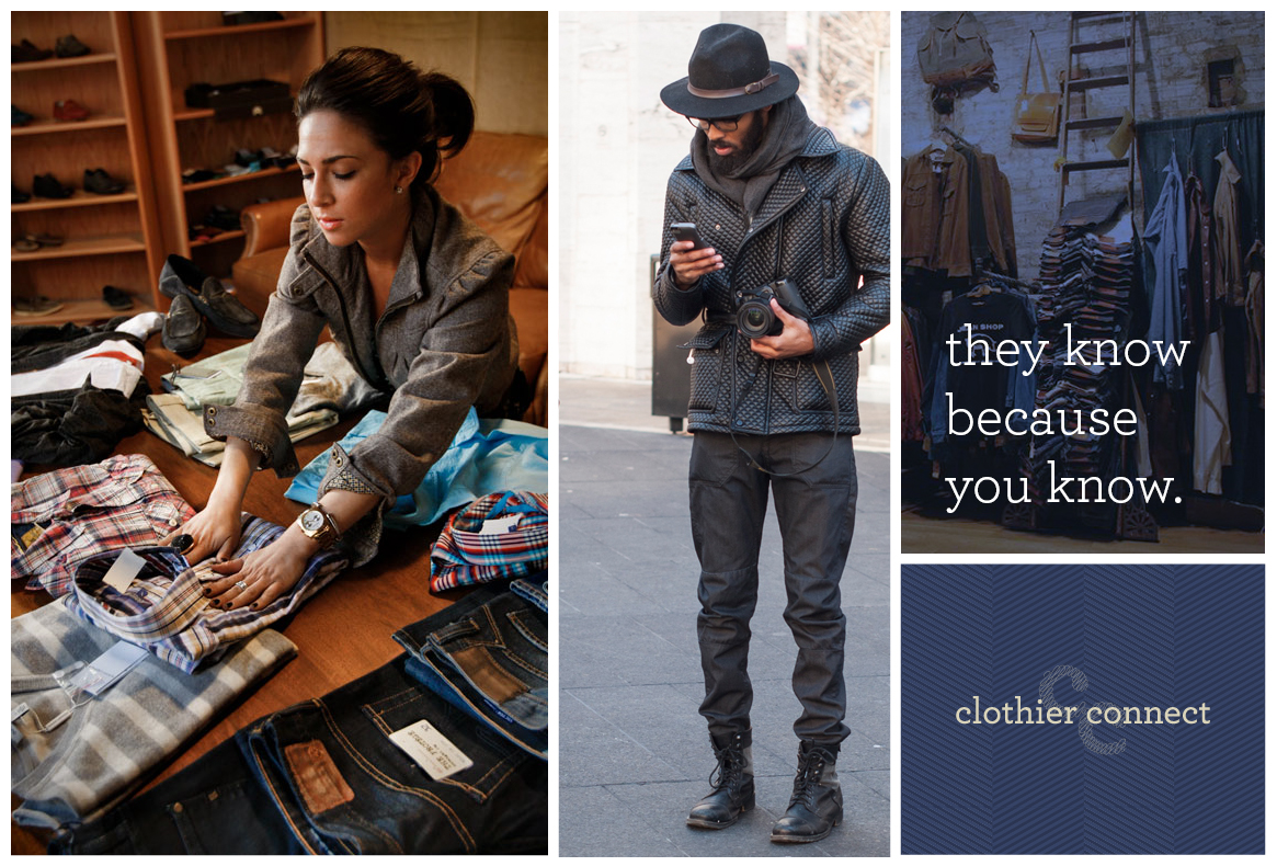
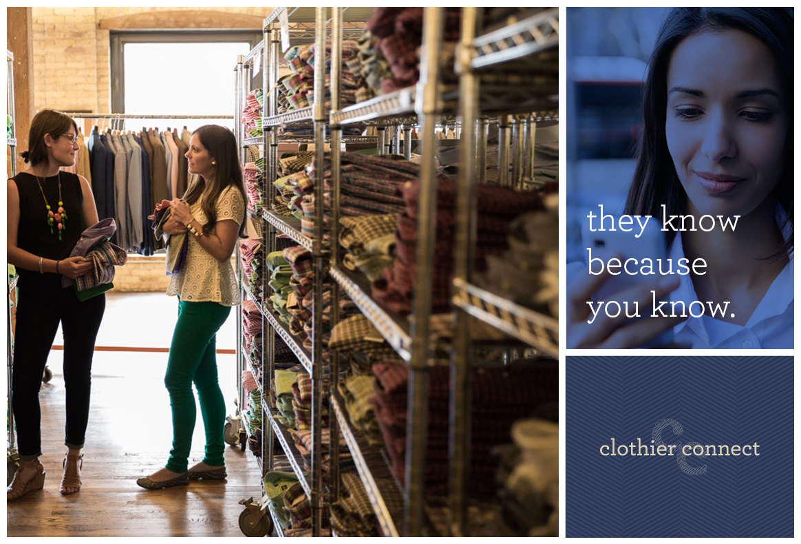
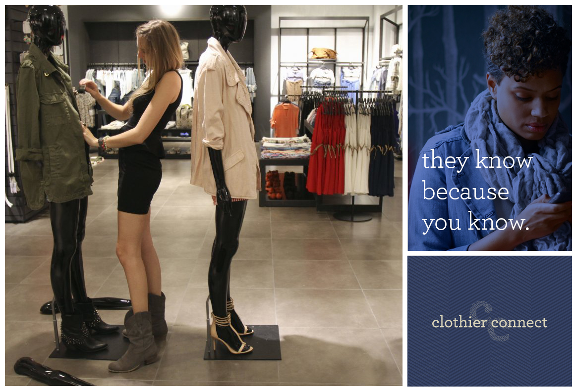
Adoption of a new identity is greatly helped by visualizing how they may look out in the world. So a few items were created to help John envision the future. Of note, two styles of messaging were suggested.
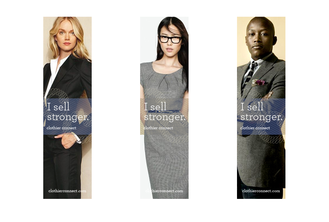
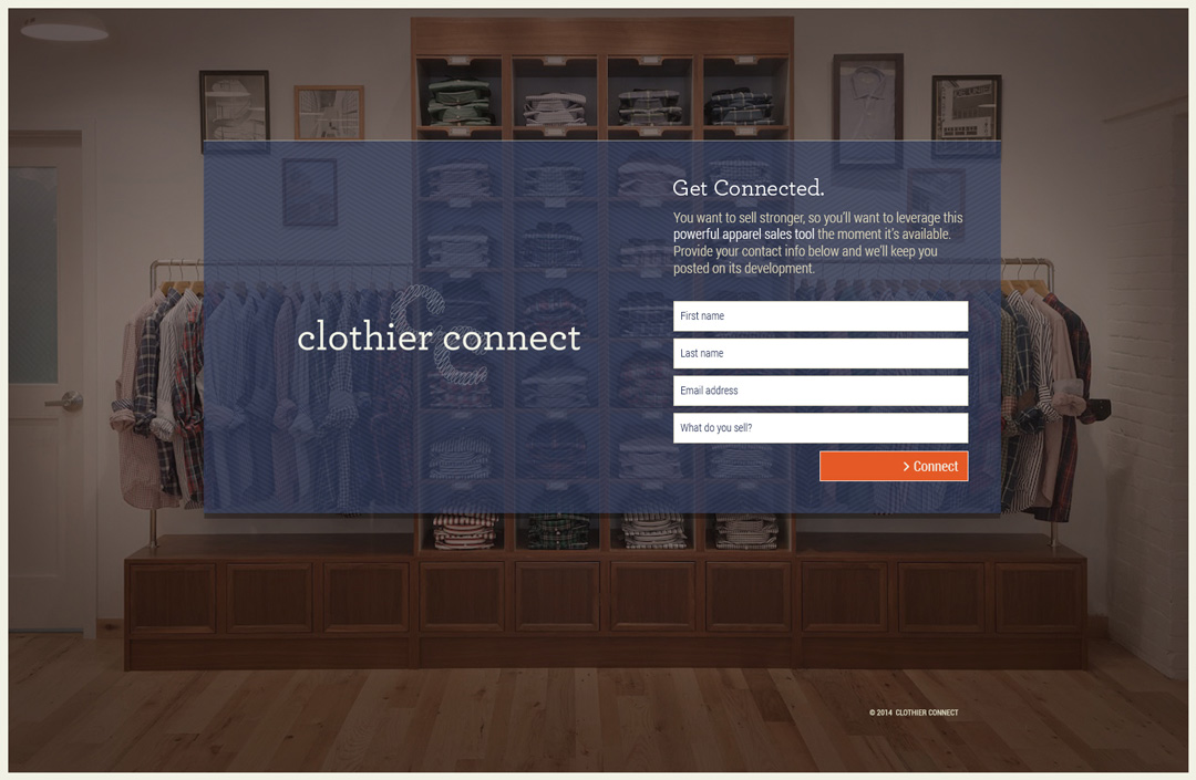
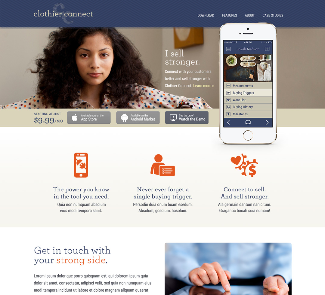
The result
An identity crafted to feel like an outgrowth of the fashion and clothier community. Something that community’s members would perhaps have had produced. The product of a culture, not merely for it. The keen understanding that John and I gained of Clothier Connect’s target audience—charismatic, career-minded, tech-curious apparel sales people who believe in the products they sell—was leveraged to craft a mark that felt less like an app logo and more like a fashion brand. And identity that would already feel familiar to potential users.
The double “C” monogram represents connectedness with a single continuous thread. A thread that is artfully imperfect to celebrate the individuality of the people for whom Clothier Connect is meant and their uniqueness of their paths to success.
Together with fabric-inspired patterns, a minimal color palette and a confidently elegant photographic style, Clothier Connect’s identity sets a winning tone. All parts work together to deliver’s a winsome message: “Stronger relationships make greater sales.”
The love
 The job that I hired Thinkory to perform was supposed to be simple. I had an idea for a brand for my business. I didn’t have the technical know-how to create the mark fully, so I consulted Ralston.
He was supposed to not only create the mark, but also define several of my brand’s attributes. So we sat and talked for a bit about my business before he got started. I shared many things – about the company, the product, the target market, the ideal user, what I wanted this tool to accomplish for them. We parted, and he was confident that he understood what I needed.
What he delivered was not what was expected. At all. Before we met, he warned me, “It’s not what we talked about, but I feel that it was the right thing to do.” Admittedly, that comment made me a little nervous. But I hoped for the best.
We met. He began his presentation, which was, in and of itself, a work of art. He carried me through the things that we’d spoken about – the traits, the characteristics that the Clothier Connect brand should embody, as well as a few other details. Then there was the mark. I must say – he gave me so much more than I imagined!
His “understanding” of what I needed and wanted is a serious understatement. What he delivered seemed like it was born of an examination of my subconscious mind. He incorporated things into that mark that I had no idea I wanted. What I requested of him was shallow in comparison to all of the depth, full body, and meaning that he epitomized through my brand. It reflects elements that are core to my heart and soul, to who I am as a person. It was, in a word, perfection.
Every time I now look at the mark that he created, I am invigorated by it. It enlivens passion and excitement for the product that I’m creating and all the good that it will do for my clients. It is, in a sense, a beacon of inspiration for everything that I hope to accomplish.
But isn’t that what a brand is supposed to be?
John G. Durden IV
Creator, Clothier Connect
