Making a mark.
Hello, John. I’ve been busy. Red One has been on my mind for several weeks. Ever since we had that conversation out of which the tag “Intelligent Web Solutions” was born I’ve been mentally preoccupied with the thought of crafting the mark Red One demands. So I grabbed my iPad and new Wacom stylus and got to work sketching, drawing, creating. It was a lot of fun that led to a mark I believe in. And I finally get to share it with you.
The problem
Strong name. Weak identity. “Red One” is a brand name that demands a distinctive mark but hasn’t one. The current brandmark has sufficient ‘message’ but no compelling visual story. It’s also just a bit too complicated.

The thinking
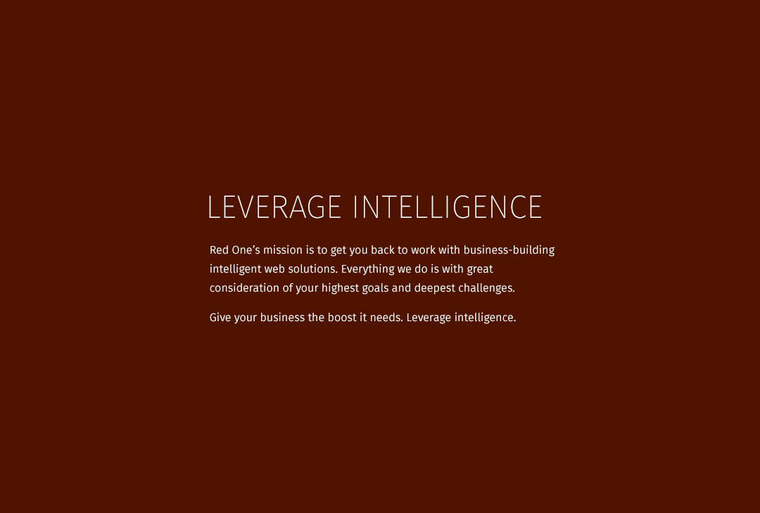
Make it simple. Like, really simple. Leverage the name. Capture a commanding distinction. It’s gotta be flexible and versatile. It also has to have an energy to it. Something that makes it feel simultaneously youthful and sophisticated.
Those thoughts swam around in my head for a few days inspiring me to doodle, sketch and draw. Eventually, something felt ‘right’ and I followed it.

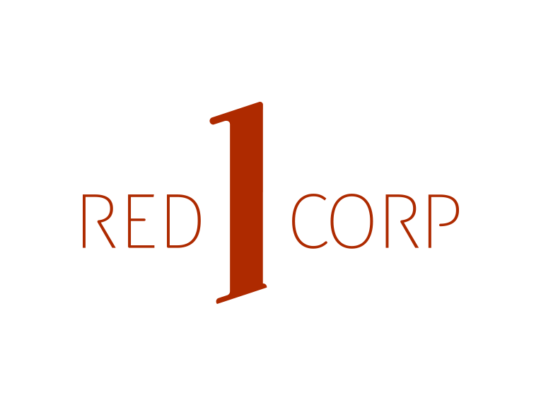
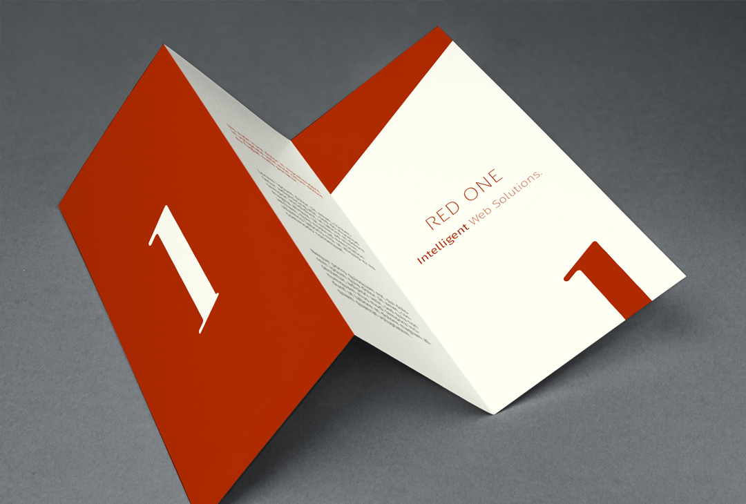
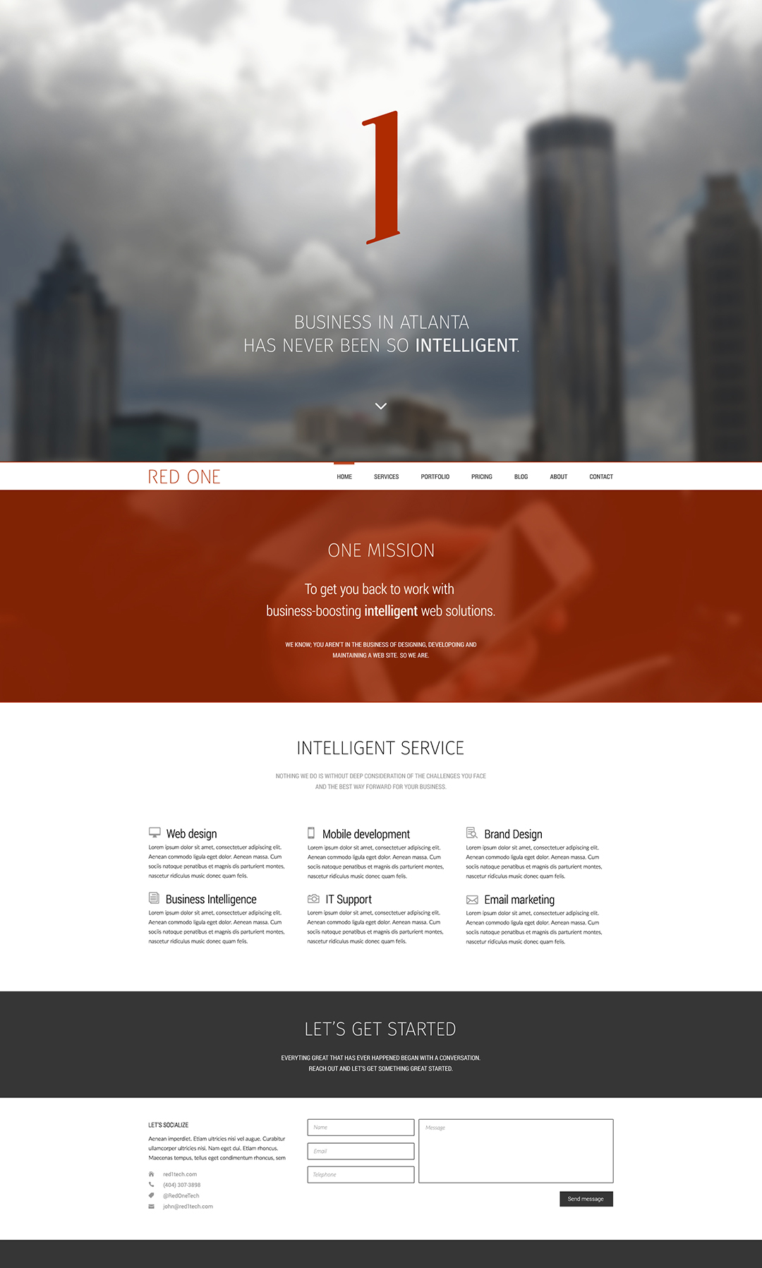
That creative pursuit brought me to this; the distinctive numeral 1 I knew Red One needed to own. Completely hand drawn, crafted from scratch and based on no typeface. This is the mark that, all by itself, can speak the name that commands respect and inspires trust: Red One.
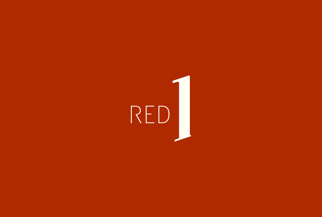
With the vanguard mark in place, I turned my attention to displaying the full name “Red One.” This first design is the primary style. It confidently states the company name by adding a simple single word to the main mark.

This wordmark is the secondary style. It displays the name in a more obviously way. It’s appropriate to employ when the vanguard mark is used in close proximity. With each name display style having situational appropriateness, the brand identity system is made nimble and flexible.
To complement the narrow and tall numeral 1 I chose Fira Sans 2, UltraLight and Book. Available for web and print from Adobe Type kit, this versatile font has the style and structure the Red One identity needed.
The future
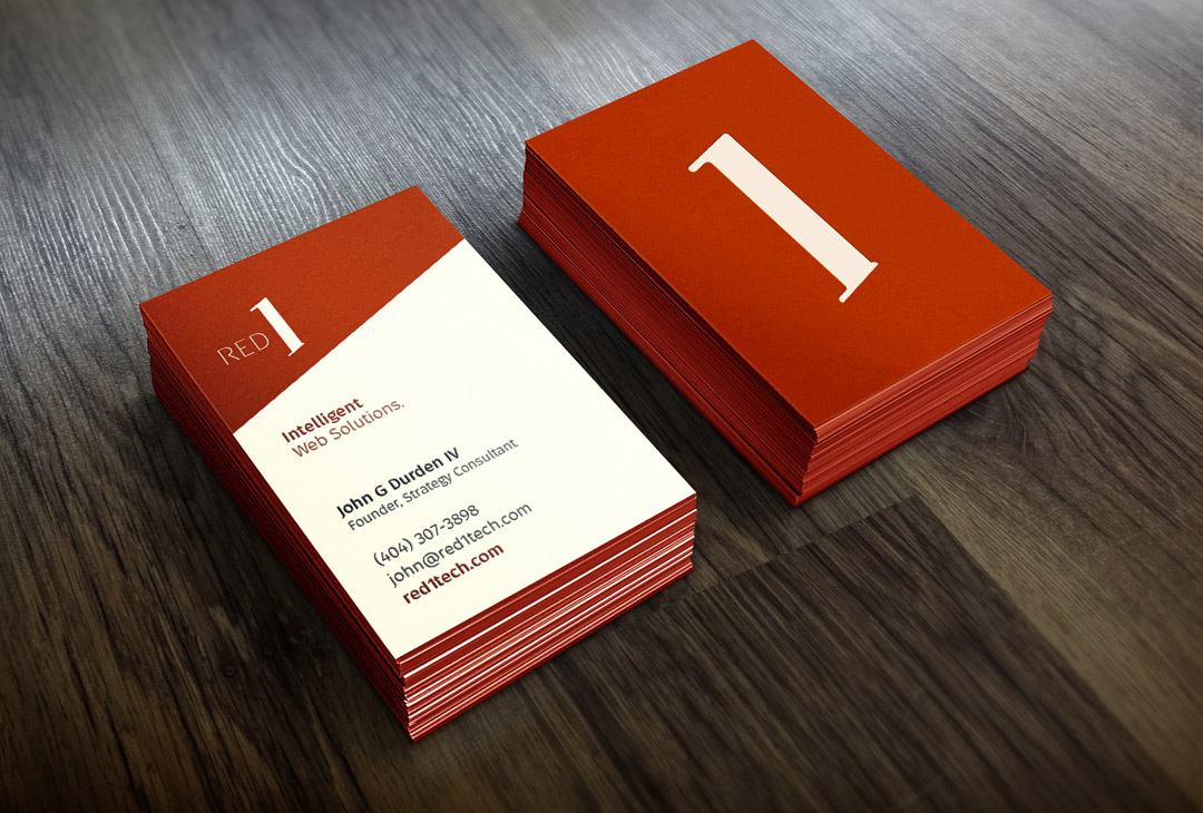
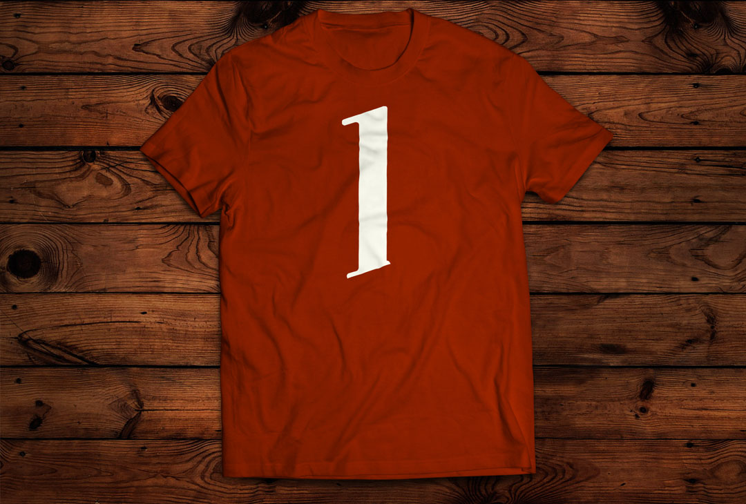
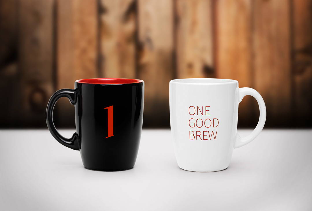
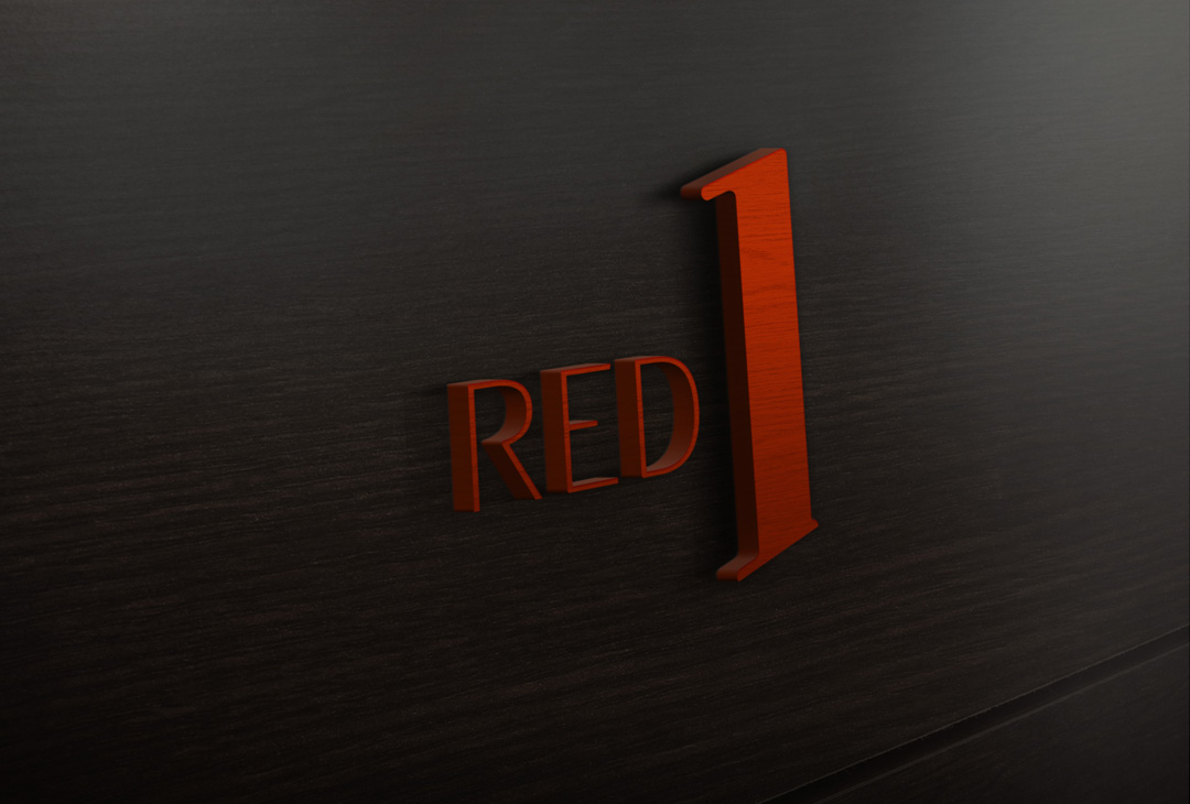
As you know, it helps to see how a brand identity might look when in use. Here are a few imagined items to help you see what I saw as I crafted the identity.


The result
A solution as bold and intelligent as those you promise to deliver to Red One’s clients. It’s a mark and identity with story as the distinctive “1” is designed to embody several meaningful corporate truths. The identity is appropriate, strong and unflinching. Best of all, it’s intelligent.